Articles features
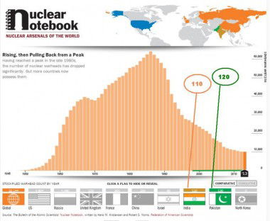
Pakistan has more nukes than India, shows new infographic

Pakistan had about 120 atomic weapons, 10 more than India, in its
nuclear arsenal last year, according to a new interactive infographic
unveiled by the Bulletin of the Atomic Scientists.
Designed by
the Bulletin, founded in 1945 by University of Chicago scientists who
had helped develop the first atomic weapons in the Manhattan Project,
the infographic tracks the number and history of nuclear weapons in the
nine nuclear weapon states.
The Nuclear Notebook Interactive
Infographic provides a visual representation of the Bulletin's famed
Nuclear Notebook, which since 1987 has tracked the number and type of
the world's nuclear arsenals.
Having reached a peak of over
65,000 in the late 1980s, the number of nuclear warheads has dropped
significantly to a little over 10,000, but more countries now possess
them, it shows.
According to the infographic, the United States and Russia both have about 5,000 weapons each.
France
has 300, China 250, the United Kingdom 225 and Israel 80. North Korea
has only conducted nuclear tests in 2006, 2009 and 2013.
"I don't
think people truly understand just how many of these weapons there are
in the world," said Rachel Bronson, executive director of the Bulletin.
"The
Interactive is a way to see, immediately, who has nuclear weapons and
when they got them, and how those numbers relate to each other. It is a
startling experience, looking at those comparisons."
The authors
of the Nuclear Notebook are Hans M. Kristensen and Robert S. Norris,
both with the Federation of American Scientists.
In the most
recent edition of the Nuclear Notebook, the authors discuss the
Notebook's 28 year history and describe how sometimes host countries
learned of foreign nuclear weapons on their soil from the Nuclear
Notebook.
Over 28 years of weapons analysis, the Nuclear Notebook
column has revealed surprise nuclear activity and spot-on arsenal
estimates while becoming a daily resource for scholars, activists and
journalists.
"We wanted a way to communicate those numbers
visually, because the world we live may be data-driven, it's also
visual," said John Mecklin, editor of the Bulletin.
"The new infographic makes this vital information even more accessible."
(Arun Kumar can be contacted at arun.kumar@ians.in)


